It’s late evening and I’m sitting at the computer with the shutters open, the lightning flashing in the distance and the sound of rain on the roof. It’s been a while since I’ve heard that sound and felt the freshness of the air.
Design trends are like the rain. They come around in due time. Like a clockwork. The Pantone colour trend for 2020 of the year is something we anticipate every January because we know it’s coming. When the announcement is made, there’s a mix of excitement, fresh motivation and a new colour to consider. For some, it can be a huge disappointment.
COLOUR TRENDS FOR 2020
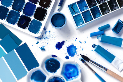
Trends follow the thoughts and behaviour of people across the world. A trend represents a constant cycle of innovation. Hence, based on the colour people are favouring in a range of applications, the Pantone colour trend of the Year for 202O is Classic Blue.
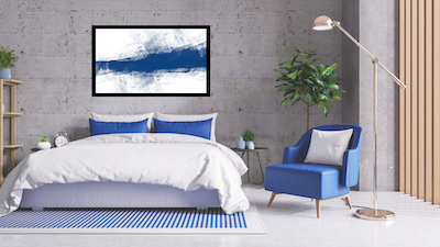
Incorporate splashes of Classic Blue into your styling rather than over dominating – Ideal for your holiday house and coastal living.
This colour sits a little lighter than the blue ink of a night sky. I see it as a light navy, which will team well with crisp whites for a coastal home. Classic Blue is said to be a ‘democratic’ colour because it’s easy on the eye and won’t offend anyone. The psychology connection with blue evokes thought and feeling and is often used to promote communication.
This colour is perfect for cushions, rugs, pots, vases and wall art. I recommend splashes of classic blue rather than allowing it to dominate your space. Combine it with your other favourites to create simplistic joy. Custom Frame your art, prints or photographs with frames that will showcase your art work for you to enjoy.
You will be surprised that once you are aware of this trending colour, you will notice it everywhere. Magazines, shop windows, products, interior magazines and general advertisers are incorporating the classic blue into their design.
THE ADVANTAGE OF A ‘TREND’
Following a trend has advantages. We live in a busy world and with the addition of technology, sometimes our choices are overwhelming. Sticking to a trend:
- Offers a quick solution to making a design choice – you can be confident it’s OK.
- Allows us to show our friends that we are modern and up to date (impresses our adult kids).
- Secures our spot as ‘one of the tribe’ and allows us to be connected.
ARTISTS + TRENDS
Artists will benefit when wishing to sell their work if they embrace the current trends. Be aware of this when finding your market. Your art will be usually be purchased to enjoy in a home or office space. People, sometimes subconsciously, will be attracted to a trending colour and style and colour is predominantly the first criteria that people consider when selecting artwork.
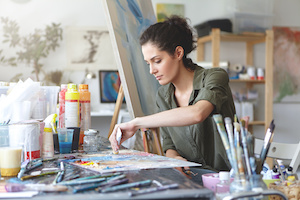
Artists can benefit in sales by tapping into the latest colour trends and styles. Like it or not, people are influenced by what they see and your art is, in most cases, destined for the walls of homes.
COLOUR = JOY
Aside from Classic blue, the biggest and the most exciting trend for 2020 is the general addition of colour. In interior design, we’ve seen a long run of monotones, neutrals with grey, white and creams dominating all aspects of home styling. Now, keeping the neutrals as a design foundation, we are encouraged to add colour. Lots of it. Pop it, smooth it, paint it, slap it on, mix it up, frame it and enjoy the results on the walls of your home. Colour brings joy and hope to the new decade. 2020 Vision!!
Finding a colour that you love and incorporating this onto your walls and in your home styling is also a simple and joyful thing to do. Colour evokes feeling and surrounding yourself with the colours you love provides you with emotional connection. Adding colour brings soulfulness and joy.
Just like listening to the rain.
Have a fabulous and joyful 2020
Jen Interior Designer CFD